Navigating the Shadows: Understanding Dark Patterns in UX


Ever felt nudged into decisions while navigating a web/app? Blame dark UX design patterns.
In the digital world, where user experience (UX) can make or break a product, there's a nefarious side to design that often goes unnoticed by the average user: dark patterns. These are deceptive design techniques used in websites and apps to trick users into doing things they didn't intend to do. From hidden costs to misleading navigation, dark design patterns are the digital equivalent of a sleight of hand, and they can have serious implications for user trust and privacy.
What Are Dark Patterns?
The term "dark pattern" was coined by UX professional Harry Brignull in 2010. It refers to user interface design strategies that benefit an online service by coercing, steering, or tricking users into making decisions that they might not otherwise make, often at their own expense or inconvenience. These can include making purchases, signing up for recurring subscriptions, or sharing more personal information than necessary. Dark patterns exploit human psychology and can often lead to user frustration and distrust. These manipulative design tactics go against the core design principles of ethical design, which prioritize user needs and experiences.
Types of Dark Patterns:
Dark patterns come in various forms, each with its own deceptive qualities. Here are 18 types of dark patterns:
Trick Questions
These are often found in forms or during sign-ups, where questions are worded in a way that confuses the user, leading them to inadvertently agree to something they didn't mean to, like subscribing to a newsletter.
When Apple released iOS 6, one of the few new features not enthusiastically promoted by the company was Identifier for Advertisers (IDFA) ad tracking. Under the "General" menu, Apple introduced a menu item listed as "Advertising."
If you haven't been here before, the only option in the advertising menu, "Limit Ad Tracking" is probably selected "Off."
But let's take a closer look at the way this is worded. It doesn’t say “Ad Tracking – Off” it says “Limit Ad Tracking – Off”. It’s a double negative. So, basically when the switch is off, It’s not being limited, but ad tracking is actually on.
Off means on!
This is a great example of a "dark pattern."

Bait and switch
Users are led to expect a certain outcome from an action, but a different, often undesirable action occurs instead. One such example of the bait and switch technique is to offer a cheap or even free product. But there's a catch, of course. When users get to the checkout, the product turns out to be charged and the price might have been hiked.
Just like other dark patterns, this trick can help you make a profit once. But in the long term, you'll lose customers. Instead, work on your product quality and marketing strategy to attract your target audience the legitimate way.
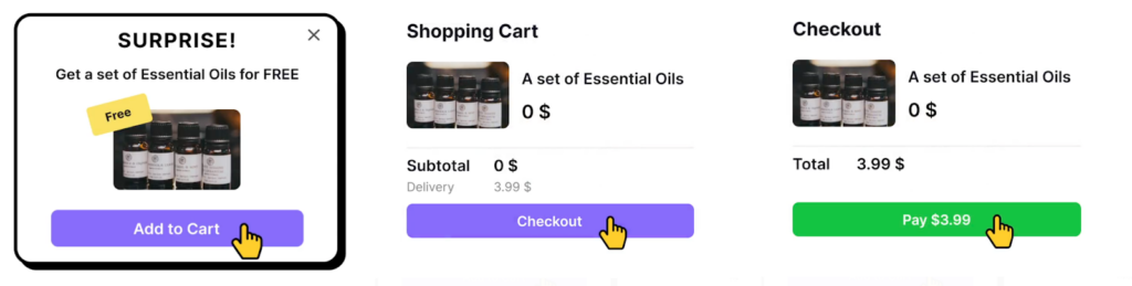
Sneak into Basket
Sneaking extra items into a user's basket is no better than taking one out. During checkout, users want to see what they're purchasing — no more, no less. Unfortunately, some products and services don't follow this simple rule. For example, apps and websites might offer goods for free, but once users agree, they'll add the item to the basket for a price.

So what can we do instead? Provide suggestions and recommendations based on users' shopping history. When users feel the freedom to choose, they're more likely to buy the product or at least consider it. Research shows that positive emotions toward a brand have a significant influence on loyalty.
Roach motel
Roach motel is a dark pattern that refers to something that you can quickly get into but can't easily leave. The analogy comes from the insect trap with the same name. In UX design, a roach motel is a product or service that is very difficult to cancel. For example, an automated monthly subscription that you have to jump through hoops to cancel.
In reality, the more you deter users from leaving when they want to leave, the more determined they become to leave. A much better option is to be honest and provide an easy exit. According to usability heuristics, visible exit options make users feel in control and less frustrated.

Privacy zuckering
I bet you have a guess where the term privacy zuckering comes from. It was coined after Facebook founder Mark Zuckerberg following the Facebook privacy scandal in 2018. In general, privacy zuckering means selling personal information semi-legally. For example, by hiding the agreement in the deepest places of the Terms and Conditions document. It also includes tricking users into sharing more information than they intend to.
This dark pattern can also make it difficult for users to find and adjust their privacy settings. For example, a website may require users to navigate through multiple pages or menus to access their privacy settings, making it less likely that they will do so.
Users' privacy should be the primary goal by making sure users can easily access the Privacy Policy and Terms and Conditions of the product and also by making sure that the documents are written in a clear and straightforward manner. For example you can see that here a pop up demands for full access to the contacts and all the data claiming the app will not work properly if the access is not given, and when it is given they usually take advantage of the data to exploit without our consent.

Confirm shaming
It is a way of guilt-tripping potential customers. Think of opt-out buttons like "No thanks, I don't care about my health" on fitness apps or "No thanks, I don't like delicious food." The goal is to elicit the feeling of shame and a fear of missing out. Many newsletters, apps, and websites use this approach to force new users to sign up or prevent existing users from unsubscribing.
Shame is a powerful emotion that may make users uncomfortable. It can also trigger stress and anxiety. Avoid this dark pattern in your designs and use positive motivation instead.

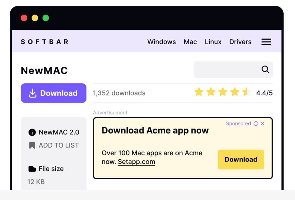
Disguised ads
Disguised ads are the chameleons of the marketing world. Their purpose is to adjust and blend with the website or app to match their surroundings. These ads may look like other content or navigation elements so that users accidentally click on them. On social networks, ads can look like friends' posts; on sites with software, fake download buttons can lead to other web pages with ads.
Forced continuity
We could call forced continuity when a free trial with a credit card requirement automatically converts into a paid subscription without explicit consent or adequate warning or even some products just love to play hide-and-seek with their opt-out option. A common use case is to disguise the Unsubscribe link as plain text. The assumption is that if users can't find the opt-out option, they'll stay subscribed. Needless to say, this won't make users happy.

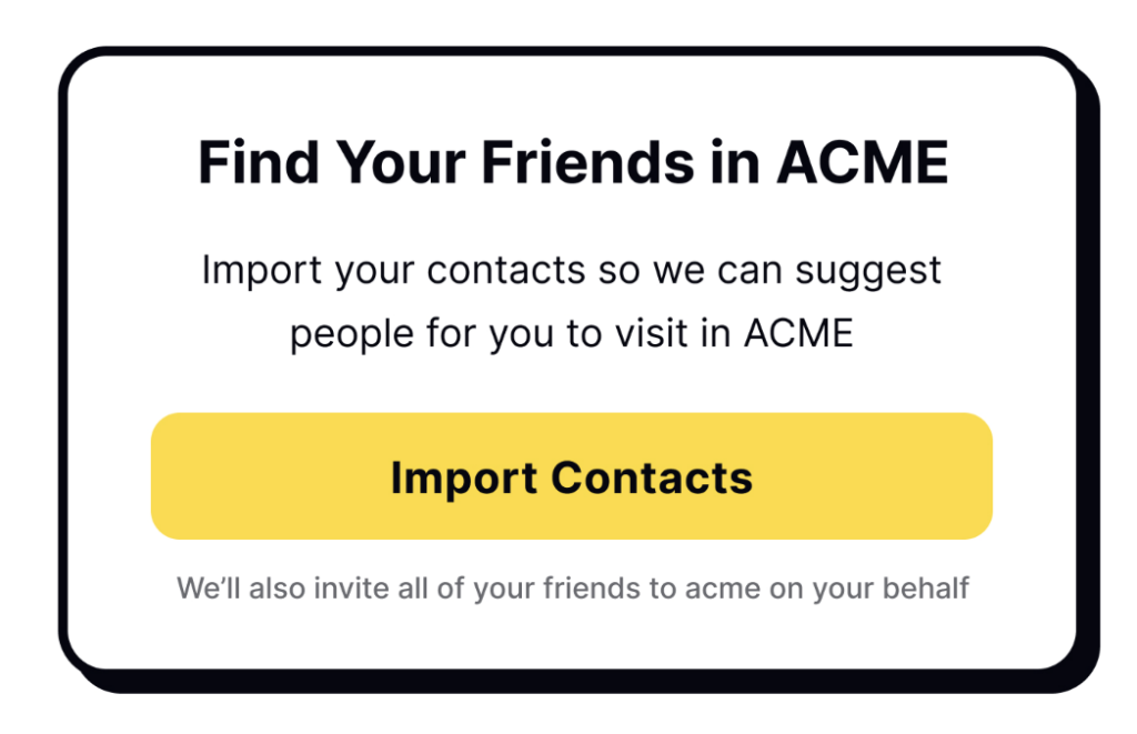
Friend spam
Friend spam is the worst gift you can give your email contacts or social media followers. This dark pattern occurs when an app asks for permission to access your contacts under the guise of giving them some benefits. It results in bombarding your contacts with messages on your behalf. Such breaches of privacy are often infuriating. In 2015, users sued LinkedIn for succumbing to such practices, and the platform was fined $13 million.
Price comparison prevention
To understand how cheap or expensive a product is, we need to compare it to other similar products. Unfortunately, some companies are determined to prevent users from doing so. The assumption is that if users can't compare prices, they won't realize that a product costs more than elsewhere. Examples of this include not listing price per weight or having too many subscription plans with unclear differences.
In the example below you can see that in the left card the price of the bananas was in a bunch and on the left its with pounds making it difficult for the user to choose the left or right card by comparing the prices to determine which is better.

Misdirection
Misdirection is a dark pattern that involves using design elements to distract users from what is actually happening. For example, a website might use a bright, flashy graphic to draw the user's attention away from important information, such as the fact that they are signing up for a recurring subscription. Misdirection is a manipulative tactic that undermines trust and can lead to customer dissatisfaction. To avoid this, focus on creating clear and honest experiences that prioritize user understanding and consent.
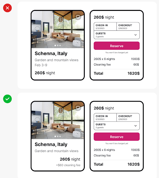
Hidden costs
Have you ever tried buying cheap tickets or products only to discover hidden fees and taxes at the checkout? Meet the hidden costs dark pattern. The strategy is to lure customers in with low prices. By the time users find out the actual price, they have already invested too much of their time and effort to leave. For example, users might have entered a lot of information and navigated through too many steps. Some users will still finish the checkout when encountering hidden costs, but this will leave them with a bitter taste.
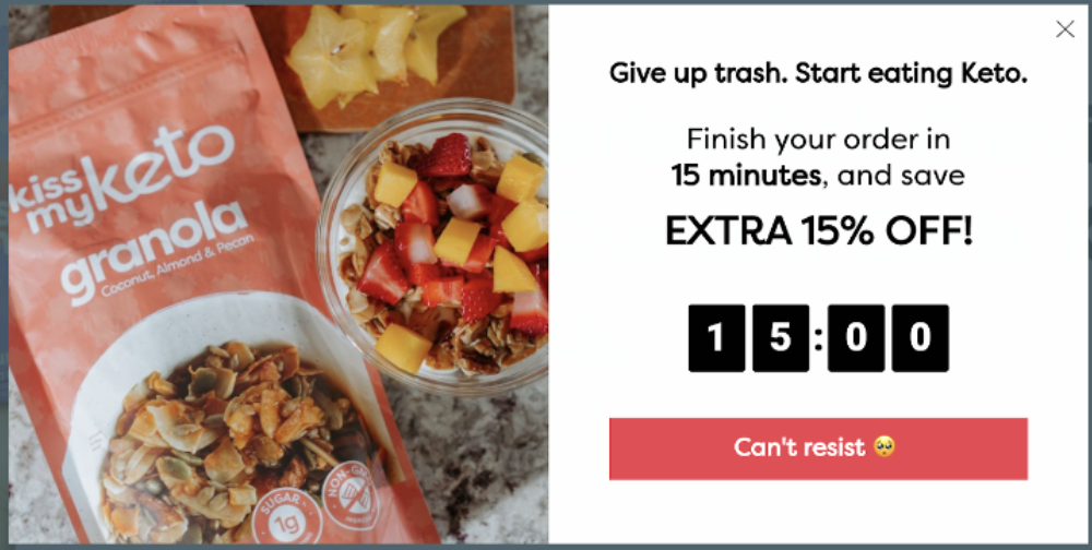
Time pressure
You must have felt this pressure to make a decision maybe while shopping on the internet. Yes, this is a time pressure strategy created by implementing a countdown timer or a message suggesting limited availability to create a sense of urgency, pressuring users into making quick decisions that they might not have made under normal circumstances.
Interface Interference
We define interface interference as any manipulation of the user interface that privileges specific actions over others, thereby confusing the user or limiting discoverability of important action possibilities. Interface interference manifests as numerous individual visual and interactive deceptions, and is thus our most involved strategy with three subtypes: hidden information, preselection, and aesthetic manipulation. For example Large popup ad with a tiny “x” button, so the user is more likely to accidentally touch the ad.

Bad defaults
Bad defaults are those that don't benefit users. Common examples include setting the most expensive subscription as default or allowing all notifications. These defaults often benefit the company at the expense of users.

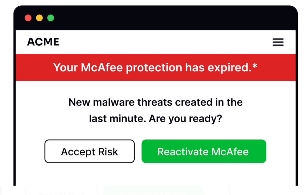
Scaremongering
Have you ever seen ads or pop-ups saying with big bright red letters that your device is at risk unless you download their fantastic software? This is scaremongering, another technique that uses fear and exaggeration to manipulate people into doing something they don't want to.
FOMO (fear of missing out)
This deceives people into thinking that an item is in high demand, which puts pressure on them to make a hasty purchase choice. Users believe they will miss out on this unique opportunity if they don’t decide quickly.

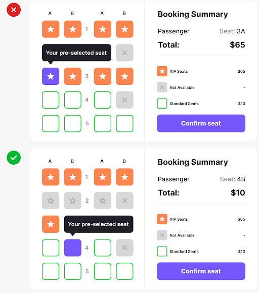
Preselection
We see this dark pattern often in conjunction with the roach motel pattern. With preselection, users aren’t even enticed or manipulated into taking actions: the platform already ‘pre-selected’ these actions for them. Again, this pattern applies to actions that benefit the company and that users wouldn’t usually choose by themselves.
With preselection, users end up subscribing to newsletters or getting premium travel insurance without noticing, for example. When the company creates actions that only benefit them and not the user, it should be completely up to them to agree to that action after being informed of the possible benefits and conditions.

Conclusion
We all know that businesses want to make profits by offering products and services, and there’s nothing wrong with that!
There's a fine line between encouraging users to engage with the platform positively and coercing them into actions that don't benefit them, or penalizing them for behaviors that don't align with the company's interests.
To avoid dark design patterns, companies can stick to various strategies. They should follow good design practices, like teaming up with a UI/UX design agency for a detailed UX audit. This helps in building a positive brand image, keeping customer trust, and sticking to the rules. In the end, it means being clear with customers and focusing on making them happy, which is good for the company's lasting success.
As UX designers, it’s not easy to balance a company’s profit goals and positive user experiences. Sometimes, we don’t even notice the design process we create causes frustration and even makes people lose money. But by learning more about dark patterns, we can understand further how to avoid them and enhance the user experience. After all, we can always strive to be more transparent and ethical to our target audience and, why not, to ourselves as well.


