ECommerce Ethics: Govt of India Bans 13 Dark Design Patterns on Ecommerce Platforms

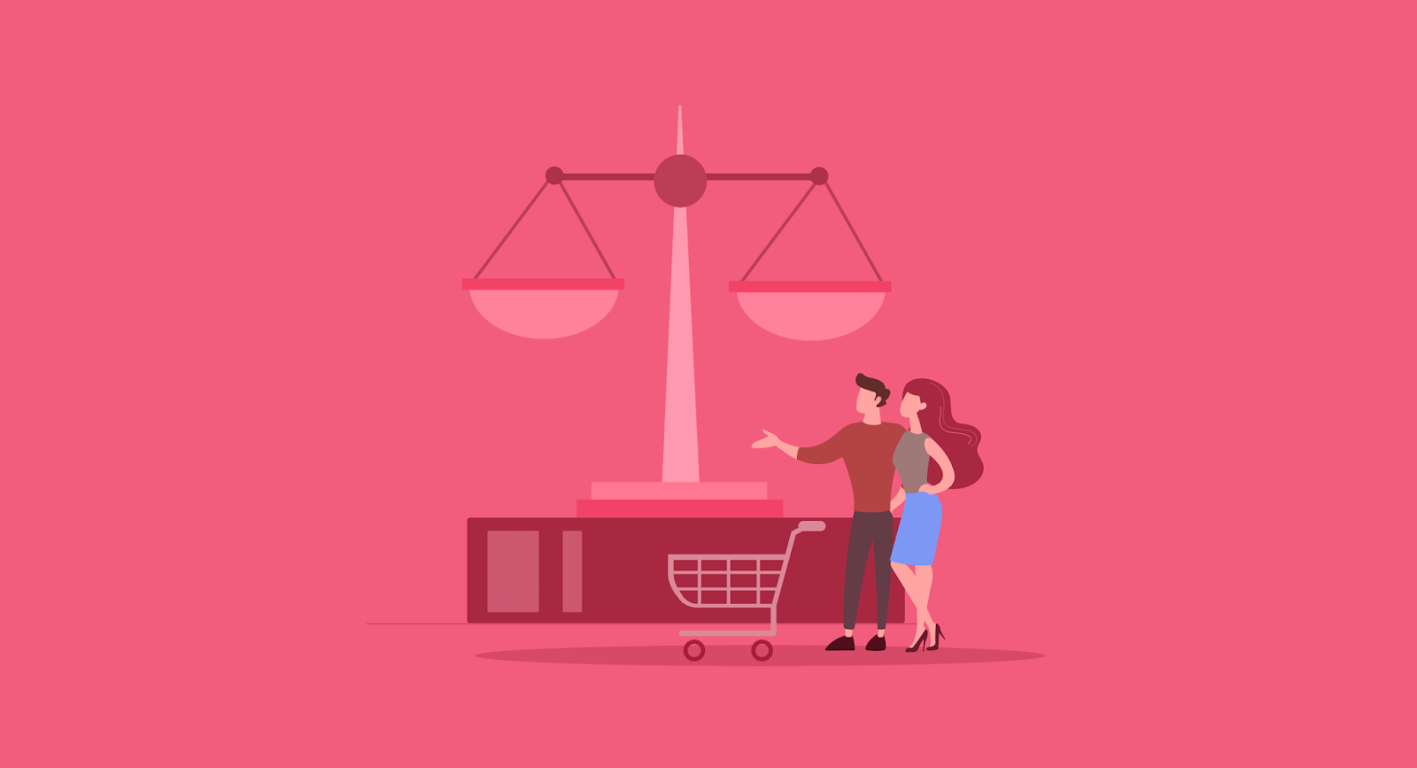
Dark patterns are under fire for their unethical tactics and potential harm to users. The Govt of India has announced 13 regulatory guidelines to control unethical and deceptive design and communication tactics used by ecommerce platforms.
Recently, the Govt. of India took a firm stand against manipulative design tactics known as 'dark patterns' on e-commerce platforms. These tactics, deemed unethical, often lead users into unintended actions leading to financial losses and personal data sharing.
Dark patterns are design strategies intentionally crafted to manipulate users, nudging them towards specific actions or decisions that might not align with their best interests. These tactics often exploit psychological vulnerabilities, using deceptive or misleading interface elements.
They create a sense of urgency, confusion, or pressure, ultimately leading users to unintended outcomes such as making purchases, subscribing to services, or sharing personal information. Essentially, they prioritize the platform's goals over user clarity or choice, resulting in a skewed and often frustrating online experience.
Read on to get the details of 13 dark patterns listed under Annexure 1 of Guidelines for Prevention and Regulation of Dark Patterns, 2023.

13 Dark Design Tactics: What are they and why are they barred?
Dark design isn't merely an aesthetic choice. It is a strategy employed in app/website design to lure customers using unethical business practices. These strategies exploit the design medium to mislead or persuade users, prioritizing the platform's interests over user benefits. Here are the 13 dark design patterns that have been officially banned in India from e-commerce websites.
1. False Urgency
Ever felt rushed to buy something online? That's the false urgency trick. They make you think it's your last chance, but it's just a mind game.
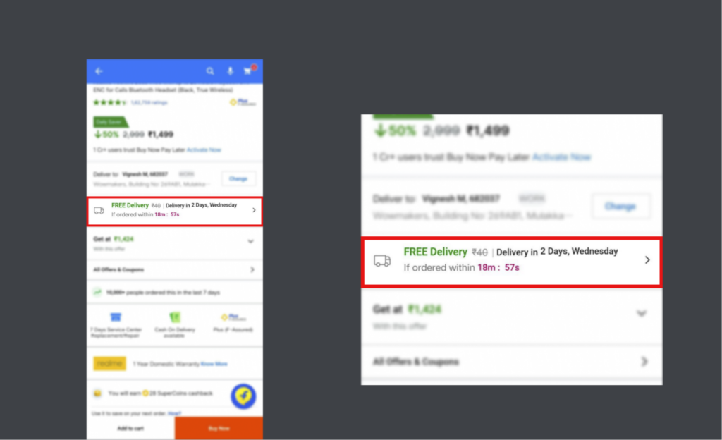
In the example above, depicted from the popular Ecommerce app “Flipkart”, you could see that the app is urging the user to buy quickly within the said amount of hours if he/she wishes to get it delivered for free, without any charge.
2. Basket Sneaking
Imagine adding stuff to your cart without asking. Not cool, right? That's what basket sneaking is—quietly increasing your bill.
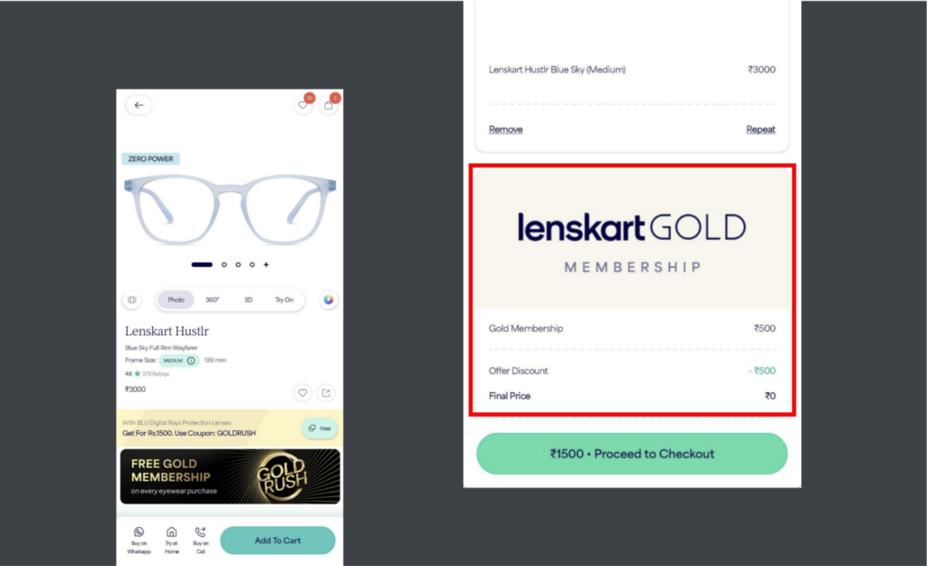
This is a soft scam used by the eyewear giant Lenskart. Whenever you buy glasses on the site and check out, they’ll add a Gold membership along with it.
3. Confirm Shaming
Confirm shaming uses fear, shame, or guilt to push users into buying something or continuing a subscription. It's all about commercial gains by messing with consumer choices. Confirm shaming plays on your emotions to make you hit that purchase button.
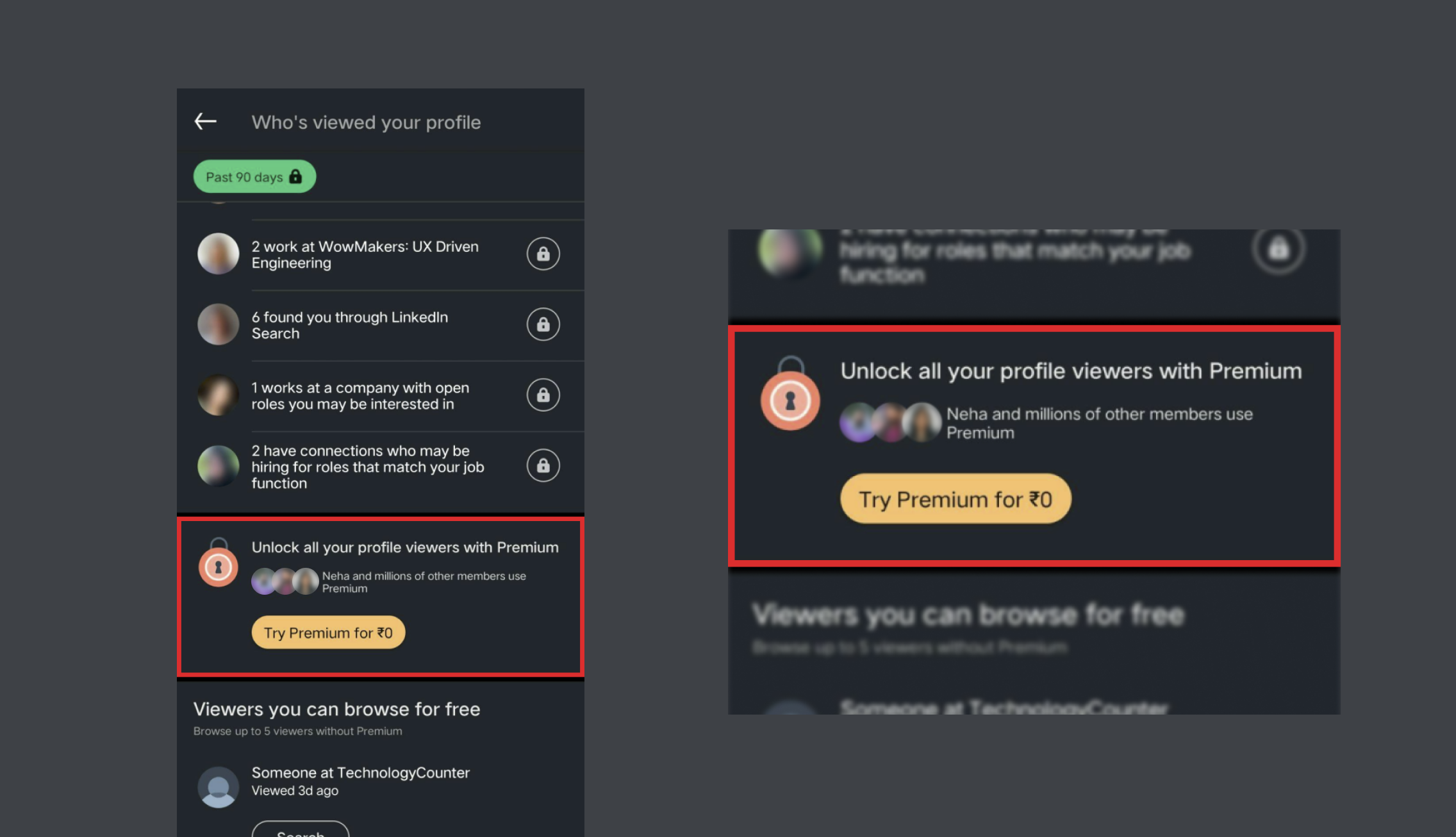
In this example, LinkedIn tries to persuade you into buying their premium plan by imposing peer pressure. To convince users to take premium membership, they showcase a list of your connections using Premium and creates “fear of missing out (FOMO)”
4. Forced Action
Want a product? Well, first, buy something else. Forced action makes you jump through hoops to get what you really want.
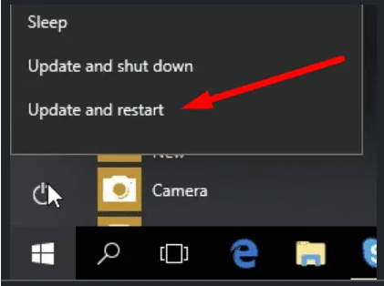
An example of this is where a lot of Windows users could relate. Whenever there’s an update, the computer gives the user a very limited number of options and doesn't give the user the privilege of scheduling the update altogether.
5. Subscription Trap
Canceling a subscription should be easy, right? With the subscription trap—they make it a puzzle to keep you paying.
A simple example of this is the newsletter subscriptions of different websites that pop up on your email feed. When you want to unsubscribe, it’s nearly impossible as they hide the unsubscribe button in very insignificant corners of the letter with very small and subtle text. Like the one you see below.

6. Interface Interference
Messing with what you see on a website? That's interface interference, and it's all about tricking your eyes.

7. Bait and Switch
"Bait and Switch" is a sneaky tactic where users are enticed with an appealing offer or product, only to be redirected to something different or less desirable once they're engaged. A classic example of bait and switch occurs during travel searches. You might spot an enticingly reasonable price in the search results for a flight or accommodation. Here is an example:

You can see, when you click to view the details, you are met with a different set of prices, often higher than the initial listing. For instance, an advertised flight to Cuba at $299 might turn out to be considerably more expensive upon closer inspection.
8. Drip Pricing
You thought you were getting a deal, but surprise! It's a different (and usually pricier) product. Classic bait and switch.

In this example, when you’re done booking seats they’ll charge you an additional 2 rupees for supposed “Charity fee”.
9. Disguised Advertisement
Ads pretending to be regular content? Sneaky, right? Disguised advertisements blur the line between info and marketing.
A perfect example of this could be seen in normal google search results.

In this example, I’ve searched for a popular task management application on the Google Play Store, and they gave me an ad for a similar software on the top.
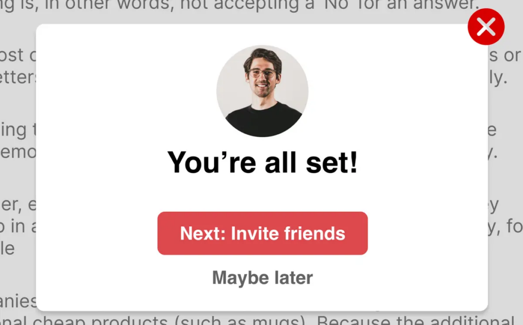
10. Nagging
In simpler terms, nagging is when a platform won't take 'No' as an answer. Let's say you are offered premium subscriptions or newsletters, but there's no way to say 'No' for good. Instead, they replace the 'No' option with 'Not now,' 'Not yet,' or 'Maybe later.' This takes away your choice and can benefit the company. Eventually, you might just give in because the platform keeps bugging you, maybe once a day, until you relent.
Here is an example of nagging and contact theft.
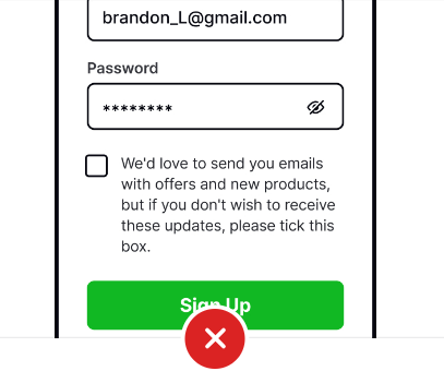
11. Tricky Question
You know those tricky questions? They are everywhere in some products online. They use confusing language to trick you into buying or subscribing to stuff you don't really want.
Here's an example: You might spot a checkbox that seems like it's there for you to subscribe to something. But here's the catch – they're counting on you to skim through the text and make a wrong assumption. The copy might actually give you the chance to NOT subscribe, but if you miss checking that box, you end up subscribed without wanting to be. Tricky, right?
12. Billing Surprise
You sign up for something free, and suddenly, your bank account takes a hit. Billing surprises happen when they quietly start charging you.
13. Rogue Malware
"Rogue Malware" is a cunning and malicious dark design pattern prevalent in the digital domain. It operates like a digital impostor, disguising itself as legitimate software or a trustworthy link, often tricking users into unknowingly installing it on their devices.
Once it infiltrates a system, this rogue malware wreaks havoc. It might bombard the user with relentless pop-ups, redirect them to suspicious websites, or even seize control of their device, causing disruptions and potentially compromising sensitive information.
The regulations aiming to control deceptive practices in e-commerce apply to all platforms providing goods and services in India, including advertisers and sellers. Non-compliance can lead to financial penalties for these entities.
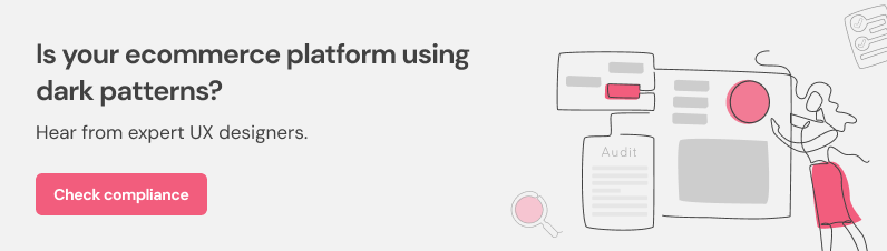
UI/UX design agencies can contribute to these ethical design practices by conducting thorough UX audits, educating stakeholders, and prioritizing user experiences. In this way, they can help e-commerce website designs to build trust, enhance user satisfaction, and ensure long-term customer relationships.


