Naming Design Tokens: A Vital Step in the Design System Journey


Design tokens are only as helpful as their names. Learn the token naming practices that make the design tokens clear at a glance to users in this practical guide.
Design tokens are the building blocks of a design system. They are essentially design decisions that encapsulate visual properties or styles, in turn applied to components, and subsequently patterns. To learn more about design tokens and get a brief overview, read our introductory article.
This article will take a deep dive into naming practices for tokens, and ideally help you find the right one for your design system.
A crucial aspect of a system’s design tokens is the naming - you communicate design decisions through tokens, by conveying the message through a shared and unified language. In fact, Dan Mall, design system expert, once said that people spend more time naming their design tokens than they do their kids and pets!
If the quality of a design system hinges on its capacity to facilitate consistency, communication, and efficient work completion, then there is no better place to begin than with language—the cornerstone of human connection.
Tokenizing Your Design System: An Organized Approach
Implementing a tokenized approach offers a structured and efficient method for managing and applying design properties. In a design system, it is crucial to keep in mind the following: consistency, flexibility, and scalability. These expectations extend to - or even stem from - the nature of its design tokens.
Why? Well, when there are well-defined building blocks, it becomes easier to build things further. Creative processes become streamlined and efficient. Creating a top-notch, scalable product demands thorough organization and clear definition every step of the way.
Naming conventions vary from one system to the next. Every organization is bound to have its own pattern - Google’s Material 3 has a specific style, while Adobe’s Spectrum goes for something entirely different, but ideal for them. Each decision is carefully advised. This is Conway’s Law - the theory that organizations will design systems that copy their communication structure.
Along with this information, it is also imperative that we understand the cons of having poorly named tokens. Some of them are:
- Misinterpretation
If poorly named, tokens can lead to confusion among designers, developers, and other stakeholders. Unclear or ambiguous token names may be misinterpreted, leading to incorrect usage or implementation. - Increased learning curve
They would require team members to invest more time and effort in understanding and deciphering the purpose and usage of each token. - Reduced reusability
Nonoptimal naming can limit reusability because they may not clearly communicate their intended purpose or context. - Collaboration
Improper naming can hinder collaboration by introducing communication barriers and misunderstandings between designers and developers.
Just as design systems use tokens as building blocks, tokens themselves are structured into levels that provide a framework for organizing and defining their properties.
Levels: Breaking It Down
Generally, it is recommended to keep token names modular and meaningful.
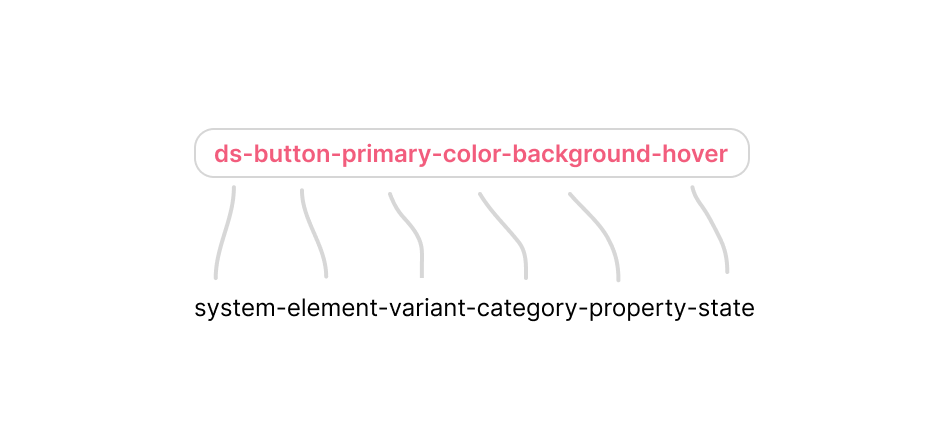
Nathan Curtis splits up a token name into 4 major levels: namespace, object, base, and modifier.
Here,
- Base: category, concept, property. This is the backbone of the token name. It is the main distinguishing factor of a token - its foundational style, like color, text, radius, etc. This style would be applied to an object (if named).
- Namespace: name of your system, theme, domain. This acts as an identifier for the token.
- Object: component group (patterns), component, element within a component. This could be a button, a component group like a form, or even an element like an icon. It essentially depicts what object the token is designated to.
- Modifier: variant, state, scale, mode. This would usually be a tailing element in the token name. It would be the differentiating factor from a token with the same attributes for other sections. This could be a hover state, dark mode style, or in 2x scale.

How different organizations name their tokens. Source: Naming Tokens in Design Systems, by Nathan Curtis.
As seen above, even the simplest token names have at least 2 parts.
Types of Tokens: The Step-By-Step Approach to Naming
A token name can also have two parts of the same level. Using these in different ways or omitting specific parts helps us create different types of tokens - global, alias, and component-specific tokens.
It is advised to name global tokens first for an associated value, and then move your way up. Tackling it step-by-step makes the process easier and aids structure. Essentially, move from abstract usage scenarios to specific ones. A hex-code may not give someone an idea about the usage, but an alias or component-specific token definitely would. For instance, the token name would have to go from the value (#F1F1F1) to a global name (gray-100), to an alias token name (color-primary), and then if required, a component-specific token name (button-primary-color-background-hover).
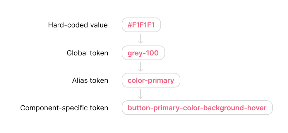
Essentially, this would mean that gray-100 is the primary color, which is the background color of a button in its hover state.
As the token inventory grows for a design system, the naming pattern has to be made sustainable. The decision-makers must consider how it would accommodate various possibilities.
It is up to the design system’s decision makers to fully draw the line on where they want the expansion to stop - do you want to talk about just the category/visual styles (color, font, spacing), or where these go (buttons, tabs, cards), or also focus on how they differ (bold, semi-bold, hover state, top margin)?
Guidelines: Best Practices and Tips
Let us first consider two examples:
A token without enough context: ButtonColor1
Why does this not work? Here are a few reasons:
- Ambiguity
The name does not specify what aspect of the button it refers to. Is it the background color, border color, or text color? - Lack of context
The "1" is vague and provides no context about its usage or theme. - Non-scalable
As more color tokens are added, names like this could become unmanageable.
A token with ample context: button-primary-background-color-hover
Why is this better? Here are the reasons:
- Clarity
This name clearly indicates that the token is for the background color of a primary button when it is in a hover state. - Scalability
The structured naming allows for easy expansion. For instance, additional states like active or focus can be named similarly. - Consistency
Following this naming pattern makes it easier for developers and designers to understand and apply the correct token without having to reference documentation repeatedly.
What is important to understand is that the token above is component-specific, thus providing ample context. In other cases, like having to know what the primary color of a design system is, a token like ‘primaryColor’ could do the trick.
Below are some guidelines to achieve better token naming:
- Avoid abbreviations
Try to use full words instead of abbreviations. It would help maintain clarity and ensure that token names are easily understandable by all team members. - Be concise, but descriptive
This may sound oxymoronic, but it is crucial to use clear and straightforward language to convey the meaning of each token. - Avoid overlapping or conflicting names
Ensure that token names are unique and do not overlap with existing names or terminology within the project. This prevents confusion and potential conflicts during implementation. - Steer clear of homonyms
Using ambiguous terms like homonyms (words that have the same spelling or pronunciation but different meanings) can lead to confusion and misinterpretation, especially when working with diverse teams or across different contexts.
Conventions: What Do Tokens Look Like?
Finally, we get down to the specifics. Tokens from organizations around the world can be seen using various naming conventions - Pascal Case (PrimaryColor), Camel Case (primaryColor), Underscore Case (primary_color), and Kebab Case (primary-color). While they all have their own pros and cons, it is up to the organization to decide what fits them best in terms of readability, experience and comfort of the team, consistency, and clarity.

Conventions used by large organizations
Feedback and Testing: Trying on for Size
The patterns described above may work for one system, while absolutely not for another. Feedback and iteration are essential to building the right token naming patterns for your design system, and would contribute highly to the success.
Trying out various patterns and testing the understanding among your design system team members will be crucial to finding the right name.
Here are a few things to test when defining your token naming pattern:
- Clarity
Ensure that the token names describe purpose and usage well. Ask team members, even those unfamiliar, to explain what they think the tokens do based on their names alone. This can help gauge clarity. - Consistency
Ensure consistent ordering of the levels in the name (e.g., object-action-property-state) and terminology. Review a sample set of token names and look for any deviations and decide on the next action. - Scalability
Token names should be flexible enough to accommodate new tokens without causing confusion or requiring significant restructuring. In order to ensure this, discuss hypothetical scenarios and cases, like adding an entirely new color scheme. - Specificity vs. abstraction
How specific should the token name be? Make sure the same token can be reused, but at the same time, make sure they are specific enough to convey details about usage or purpose. Evaluate tokens outside their immediate context to see if they still work effectively. - Implementation
Test out tokens in technical environments to see if any issues arise, like usage of reserved keywords in some languages.
Run focus groups or surveys within your team to collect feedback on the token names. Pay attention to any names that consistently cause confusion or are frequently misinterpreted.
Make sure that your token naming pattern is perfectly documented with examples. Ask team members to use the documentation to find or apply token names to see if the guidelines are clear and helpful.
Wrapping Up
In a nutshell, naming design tokens isn't just a one-time task—it's an ongoing process that helps us build a design system that's not only effective and scalable but also user-friendly and easy to work with for everyone on the team.
It's important to keep our naming conventions flexible enough to grow with the system. As our needs change, our naming should adapt too. While the guidelines above can help create better token names, testing and getting feedback from the team along the way helps us fine-tune our approach and make sure our tokens make sense to everyone involved.
Efficient token naming involves building a fundamental framework that facilitates collaboration, consistency, and efficiency inside the design system rather than merely labelling design attributes. As the design system evolves and expands, there is always more to learn and refine in the journey of naming design tokens.
Table of Contents
Drive growth with a design system that sets you apart.
Sign up for our design system services!
Contact us

