Top HMI Design Best Practices: An Ultimate Guide


Get ahead in HMI design with actionable tips and insightful time-tested strategies.
It’s the age of HMI (Human-Machine Interface), where intuitive dashboards and touch screens facilitate effective communication between humans and machines.
HMI typically refers to screens or dashboard designs that convey information, data, and metrics through graphics or visual representations of numbers.
Operators( users)oversee and manage equipment and processes in factories and plants through these screens. So, HMIs play a crucial role in modern manufacturing processes, enabling efficient, safe, and reliable operation of complex machinery.
By 2028, the HMI technology market is projected to reach USD 7.7 billion, reflecting increasing adoption of industrial automation in process and discrete industries.
As industries increasingly rely on HMI technology to enhance operational efficiency, reduce labor costs, and improve productivity, the importance of thoughtful HMI design becomes evident.
In this article, we discuss some important aspects of HMI design with a specific thrust on HMI design best practices.
Understanding HMI Design
HMI design refers to the creation of intuitive and user-friendly interfaces that facilitate interaction between humans and machines in various applications. These interfaces typically utilize visual elements, such as graphics, icons, and touchscreens, to convey information and enable control of machinery, equipment, or systems.
Here are some examples of areas of application of HMI design:
- Touchscreen control panels in manufacturing plants allow operators to monitor and adjust production parameters with simple gestures.
- Dashboard displays in automotive vehicles present vital information such as speed, fuel level, and navigation instructions in a clear and accessible manner.
- Smartphone apps for smart home devices enable users to remotely control lighting, temperature, and security systems with a few taps on their mobile device.
- ATM interface guide users through banking transactions with easy-to-understand menus and prompts.s
- Medical device interfaces in healthcare settings provide clinicians with real-time data and controls for patient monitoring and treatment.
- Pilots navigate, communicate, and monitor aircraft status using HMIs in aircraft, ensuring safe and efficient flight operations.
Evidently, there is a diverse array of HMI-based systems across various industries. While different industries may require unique functionalities and layouts for their systems, at their core, the fundamental principles of good design persist. Adhering to best practices in HMI design is critical for success and effectively reducing human errors.
HMI Design Best Practices
Design plays a major role in the effectiveness of HMI systems. A well-designed HMI is intuitive, user-friendly, and caters to the specific needs of the industrial process. With clear and concise display of information, ease of control system and prompt communication with operators are achieved. What are some HMI design best practices that can reduce the cognitive load and boost operator performance? Let’s take a look.
Reduce Cognitive Load: Put Data Into Context
Improving operator awareness isn't just about showing data—it's about putting that data into context. Dr. Mica Endsley, P.E., breaks down the process into three steps:
- Perceiving
- Understanding, and
- Predicting
It's not enough for operators to see numbers, they need to understand what those numbers mean and foresee what might happen next. This is why “ Idiot Proofing” is considered a key requirement in HMI design.
Idiot Proofing
"Idiot-proofing" refers to the deliberate efforts to eliminate the possibility of inadvertent critical actions. This involves optimizing button spacing to ensure adequate spacing between buttons to prevent accidental touches, particularly crucial on touch screen HMI consoles commonly found on factory floors.
Also, utilizing color to denote the criticality of certain activities, offering operators visual cues to confirm their actions and avoid potential errors.And adjusting the size of buttons and controls to suit touchscreen interfaces, minimizing the risk of unintended inputs due to cramped layouts.
In practical terms, this means providing information like alarms and trends in a way that's easy to understand. Responding to a critical situation by just seeing some current system values without understanding the context can lead to mistakes. So, give operators the information they need to make informed decisions before problems arise.
Here are some ways to give operators the context they need to perform at their best:
Present data that matches the mental model of the operator.
This means structuring information in a way that resonates with operators' understanding of the system's dynamics.
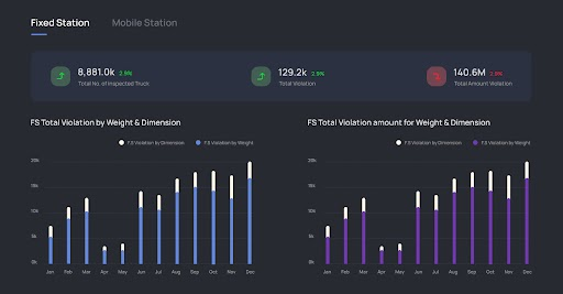
Idiot Proofing: Make important information stand out
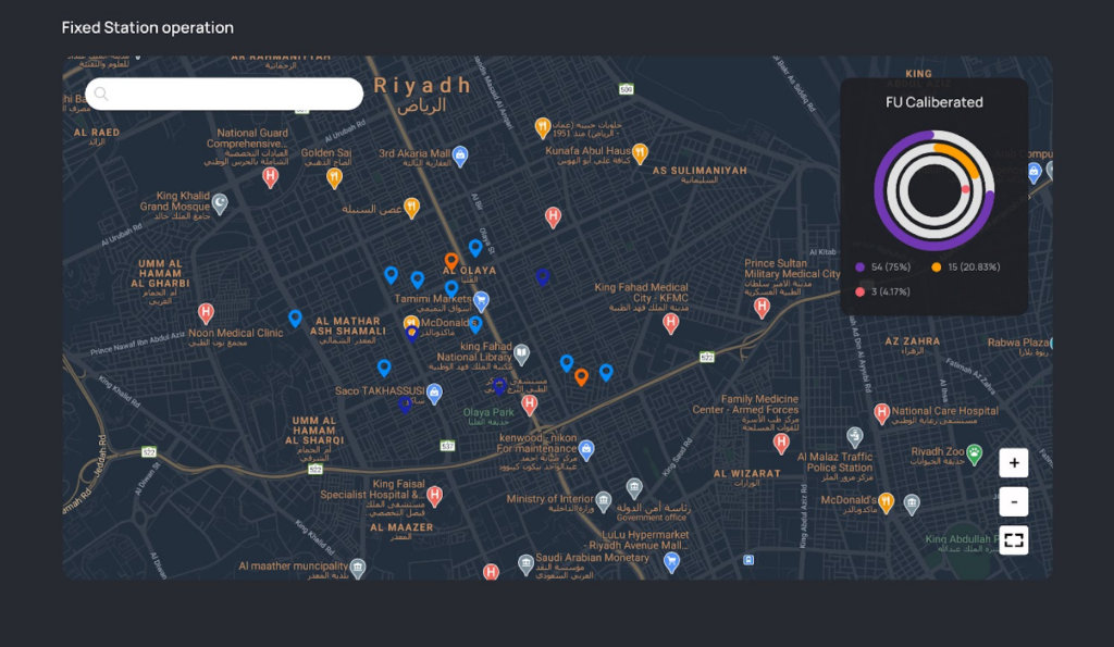
Employ visual cues, distinct formatting, or strategic placement to draw attention to critical insights and to make the information easily digestible and relevant as you can see from the image. It's a Truck weighing Station interface and clearly shows the data on the inspected trucks and the violation data.
Provide information with the data
Present data in a visually appealing format that facilitates immediate comprehension. Utilizing charts, graphs, and other graphical elements can help convey complex data relationships more intuitively.
Ease Navigation to Guide Operators with Precision
Clutter-free navigation within an HMI system ensures swift and intuitive access to desired functionalities for the operators. For this, focus on the user journey and think from users’ shoes. Here are some best practices to enhance navigation:
Consistent Placement of Important Buttons
Maintain essential buttons, such as home or main screen access, consistently visible across all screens. This ensures operators can easily navigate back to critical areas without unnecessary searching or disruptions to their workflow.
Minimal Click Accessibility
Aim to keep all screens within two to three clicks from the home or main screen. By reducing the number of steps required to reach key destinations, operators can efficiently navigate the interface and complete tasks with minimal effort.
Task-Oriented Layout Design
Prioritize understanding the workflow of the operational process. Identify tasks that are frequently performed and those that are less common. Design the layout of the HMI to prioritize frequently used functions, placing them within easy reach and minimizing the need for operators to navigate through multiple screens for routine actions.
Efficient Information Architecture
Design the information architecture to be as efficient as possible, organizing screens and menus logically based on the operators' workflow and task priorities. Group related functions together and provide clear pathways to navigate between different sections of the interface.
User-Centric Navigation Testing
Conduct usability testing to evaluate the effectiveness of the navigation design. Solicit feedback on the intuitiveness of the navigation flow and adjust the design based on user input to optimize usability.
Wisely Choose Colors and Fonts
The choice of colors and fonts holds significant sway over usability and readability. Here's how to make wise selections:
Color Usage
- Limit the palette: Avoid overcrowding screens with excessive colors. Stick to a restrained selection, reserving bright hues for highlighting abnormal conditions like alarms.
- Consistency is key: Ensure colors are used consistently throughout the interface to maintain clarity and aid user comprehension.
Font Selection
- Prioritize legibility: Opt for clear and easily readable fonts to enhance user understanding.
- Contrast is crucial: Choose fonts with sufficient contrast against the background to ensure text stands out prominently as you can see from the image.

Adaptability to Lighting Conditions
Make sure the colors and brightness of the display can be adjusted to suit different lighting environments, ensuring optimal readability at all times.
Text and Control Optimization
Optimize the size and spacing of text and control elements for maximum visibility and ease of use, accommodating users of varying needs and preferences.
Include Graphics Strategically
Graphics are visual languages that break linguistic barriers and facilitate rapid comprehension for operators. Here's how to effectively integrate graphics into HMI design:
Visual communication
- Capitalize on the efficiency of image as operators grasp the meaning of visuals faster than text or colored buttons as we have done in the Truck Weighing Station Interface project.
- While graphics are invaluable, excessively large or numerous graphics, as well as complex animations, can hinder screen performance. Limit their use or isolate them on separate screens to maintain swift response times on primary screens.
Efficient Data Display
- Different types of data necessitate varied display methods. For instance, while a numerical value may accurately convey speed, uncertainty regarding engineering units and acceptable ranges persists. Mitigate this ambiguity by supplementing numerical displays with appropriate labels and range indicators.
- Line graphs with trending functions provide a display of past and present data, facilitating intuitive interpretation of future trends. Operators can understand whether values are approaching upper or lower limits, aiding proactive decision-making.
Now that we have dealt with UI/UX design best practices of HMIs, it's crucial to ensure compliance with international standards. Let's get into that in the next section.
Adhere to HMI Design International Standards
When designing an HMI interface, it is crucial to adhere to international standards to ensure usability and efficiency. In HMI UI/UX design, ISO 9241-110: Ergonomics of human-system interaction - Part 110 Dialogue principles provides the general principles and guidelines. Here are some key points from the standards:
- General Appearance and Behavior: The interface should include buttons, saliences, and dialog boxes. These objects can be selectable or non-selectable, with selectable objects initiating actions.
- Button Design: Buttons should be large enough for easy selection on touchscreens, with a recommended minimum size of approximately 1.5 cm on the shortest side. Button behavior can be momentary or two-state, with clear visual indicators for the selected state.
- Saliences: Colored or textured saliences should be used to indicate the condition of buttons and other objects, such as alarms or required user attention.
- Dialog Boxes: Dialog boxes are used for supplemental information, user input, or error reporting. They should include a title bar, display area, and window control buttons (e.g., OK, Cancel).
- Navigation Model: The basic network navigation model should minimize user actions and time. It has to allow users to move horizontally between different sections of the panel without the need to navigate up and down menus.
- Display Layout: The basic layout includes four panels—title, information, command, and navigation.If the panels are tiled edge to edge, the interface should support left-hand orientation for the command panel.
- Title Panel: The title panel should contain essential information such as host communications status, date/time, current view name, and optional elements like corporate identifiers or logos.
Maximize HMI Efficiency Through Thoughtful Design
A well-executed HMI design is crucial for optimizing operator performance and overall system functionality. Users prioritize three key attributes in a product: speed, reliability, and ease of use. By adhering to the best design practices outlined here, these objectives can be effectively realized.
As a leading UI UX design company, we have expertise in HMI UX design services and these design practices are drawn from our experience. Failure to prioritize design may lead to under featured HMI systems, ultimately resulting in increased expenditure and user dissatisfaction over time.
If you have any queries, don't hesitate to reach out to us! Let us prepare a detailed chart for your HMI design needs.


