Energy Management Dashboards, a compass for your sustainability journey


As organizations worldwide focus on meeting their sustainability goals, energy management takes the spotlight. A smart dashboard design is a compass for managing and optimizing energy usage and making educated choices.
Energy management dashboards are gaining prevalence due to the growing focus on sustainability initiatives across governments and businesses across the globe. By presenting crucial metrics like real-time usage data, efficiency analytics, cost breakdowns, and predictive insights, it supports well-informed decision-making and offers valuable feedback on energy consumption patterns.
In this article, we take you through the design objectives and implementation approach of energy management dashboards with a specific focus on one of our projects, IQnext. The article sheds light on how an efficient dashboard UX design can help organizations in forecasting and decision-making by assessing current and historical data.
How the Energy Management Dashboard can be a vital tool for sustainability initiatives
Energy Management Dashboards are a valuable ally to organizations aiming for energy-saving practices. Specifically, leveraging a clear and intuitive dashboard design offers numerous benefits in the pursuit of energy efficiency. Let us check it out one by one.
- Cost savings by notching up energy analysis
Analyzing energy costs is a Key Performance Indicator in energy management, especially to make financially responsible choices. Energy management dashboards utilize this analysis to calculate an organization's energy expenses, helping businesses make financially sound decisions. Understanding these costs enables organizations to find ways to save, like shifting energy-heavy tasks to off-peak hours or investing in more efficient equipment.
- Energy efficiency benchmarks to attain operational optimization
Energy efficiency benchmarks are predefined goals for reducing energy consumption. Energy management dashboards utilize these benchmarks to set objectives and monitor progress. By comparing an organization's energy efficiency with industry standards and similar enterprises, benchmarking helps identify areas for improvement.
- Carbon emissions tracking and compliance
Monitoring carbon emissions has become a crucial obligation for organizations amidst growing environmental concerns. Energy management dashboards track carbon emissions as a key performance indicator (KPI), allowing companies to evaluate their environmental impact. This data serves organizations aiming to reduce their carbon footprint and fulfill emission reduction goals, aiding in sustainability reporting and regulatory compliance.
- Energy-efficient behavior in users
In energy management, an emerging field known as "energy behavior analysis" examines the link between employee actions and energy use. Energy management dashboards help companies devise strategies to encourage energy-efficient behavior by using analytics to assess the impact of employee activities on energy consumption.
- Efficient Risk Management
Alarm and notification systems are common features in energy management dashboards, alerting stakeholders about equipment faults or excessive energy usage. These technologies enable proactive energy management by swiftly addressing issues and preventing energy waste. Another strategy, predictive maintenance, relies on analytics to anticipate equipment breakdowns. Energy management dashboards use this key performance indicator (KPI) to predict maintenance needs, helping organizations reduce energy losses caused by inefficient or damaged machinery through timely maintenance before failures occur.
Designing an Energy Management Dashboard for Sustainability
Approaching IQNext, an innovative building management app required an understanding of target users, design applicability, and functionalities for energy, device, and space management. However, our task at Aufait UX went beyond that to effectively present energy management data, such as consumption trends and real-time usage, through design.
How did we do this? By asking questions.
Who Are We Designing For?
Through user research, we got into understanding diverse stakeholders engaging with the energy management dashboard. This allowed us to create user personas for various roles—facility managers, executives, and energy analysts. Gathering insights into their objectives, challenges, and preferences became the foundation for our design approach.
In our research for IQNext, we recognized our primary audience as building managers, facility operators, and sustainability teams within organizations. Our emphasis was on users seeking real-time insights into energy usage, system efficiency, and sustainability metrics for informed decision-making in building operations.
What Information Drives Decision-Making?
We conducted detailed interviews and surveys to collect data on crucial metrics guiding decision-making for each user persona. This involved exploring their decision processes and the specific information influencing energy management and efficiency. These insights helped us prioritize dashboard information and features.
Based on this, we centered on real-time energy consumption data, efficiency metrics, and environmental impact indicators. Throughout our design, we emphasized offering actionable insights, trends, and alerts. This approach helped users make informed decisions about energy optimization, sustainability objectives, and building performance.

What Key Performance Indicators Matter Most?
The next big step was to identify the key performance indicators (KPIs) that are most relevant to their roles and organizational goals. For this, we conducted collaborative meetings to prioritize the KPIs based on their impact on energy management strategies. This collaborative approach ensured alignment between user needs and dashboard features.
Some of the KPI features that were reflected in the final product are:
- Energy Consumption Trends: Showcasing historical and real-time data to identify usage patterns.
- Carbon Emission Reduction: Displaying environmental impact through reduced carbon emissions.
- Operational Efficiency: Highlighting efficiency in building systems and processes.
- Cost Savings: Illustrating financial benefits of energy optimization efforts.
- Device Health: Monitoring connected device performance for optimal operation.
- User Engagement: Tracking user interaction and adoption of energy-saving recommendations.
How Can Users Tailor Their Experience?
To allow users to tailor their dashboard experience, we provided a customization option. We also incorporated user-friendly settings for alerts, notifications, and data visualization preferences that would enhance the customization options. This ensured that each user could optimize the dashboard to align with their specific needs and focus areas, creating a more personalized and efficient user experience.

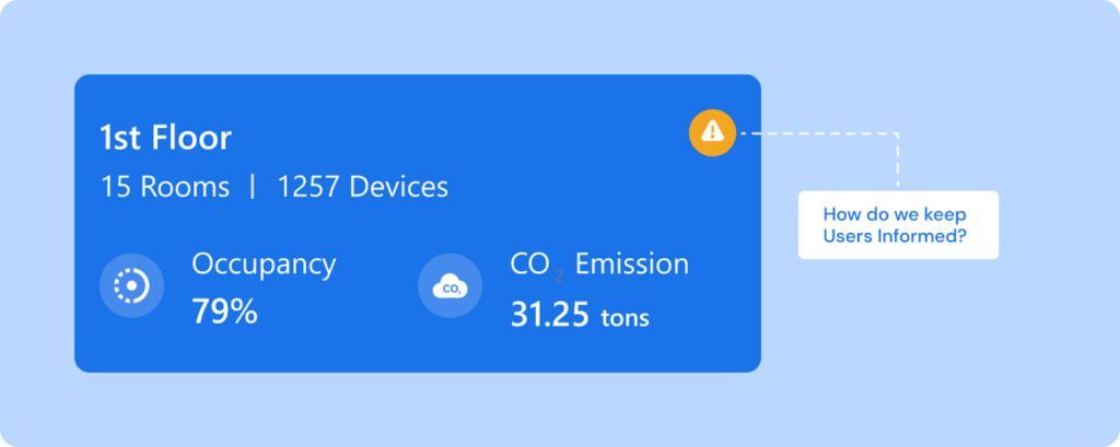
How Do We Keep Users Informed?
We set up a strong notification and alerting system to keep users updated on important events or deviations from typical energy patterns. Additionally, we included interactive reports to enhance understanding of energy patterns, introduced push notifications for proactive updates, and integrated user training directly into the interface for smoother onboarding.
How did we Ensure an Intuitive User Experience?
For a user-friendly experience, we relied on user-centered design principles and conducted usability tests during the entire design process phase. We emphasized clear and simple data visualization, making complex information easy to understand. We also maintained a consistent design style, provided user training, and continuously tested and improved based on user feedback.
How Will the Dashboard Grow with the Organization?
The dashboard must adapt smoothly to the organization's changing needs. The use of modular design facilitates easy integration of new features or data sources. Customization allows stakeholders to personalize the dashboard as per the evolving circumstances. As an organization grows, continuous user feedback and iterative design will refine and expand the dashboard to match the organization's growth.
Integrate dashboards into your energy efficiency plan
Incorporating an energy management dashboard into your business operations is a significant step toward sustainability. Effective measurement and communication of energy management KPIs through an intuitively designed dashboard will enhance employees' awareness leading to faster adoption of sustainability practices and approaches.
Research by McKinsey suggests that companies with strong ESG ratings consistently outperform the market over time. Although sustainability strategies might require initial investments, they often result in long-term benefits.
Our efficient UI/UX design of the IQnext energy management dashboard has shown substantial results: clients experienced a 20% reduction in energy costs post-implementation. This reduction is a big number that was realized with small sustainability efforts. As a UI/UX design agency, our goal is to provide sustainable and affordable enterprise design services that contribute to a cleaner Earth alongside driving efficiency.
Table of Contents
Let us design your energy future.
Drive success with our precision-crafted dashboard designs!
Contact us

