Embrace the void: Designing meaningful empty states


Empty states in interfaces often go unnoticed, yet they play a defining role in user interaction. Have you considered their impact on enhancing the user experience and driving business advantages?
The phrase ‘Meaningful Empty State’ might seem like a bit of an oxymoron. However, it's anything but that.
Empty states, simply put, are screens for when nothing is happening. Literally. Empty states are the types of screens that tell the user that the content doesn’t exist (yet). The key role of these screens is to keep them informed so that they don’t give up on the application. It is an unavoidable part of the user's journey and can routinely come up in between phases.
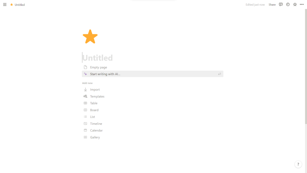
Empty screens usually look something like this.

One of Aufait UX’s very own designs, this screen is shown when there is no content available for the user to view.
When used correctly, an empty state can provide a teaching moment, help rectify incorrect actions and even help solidify the platform’s personality.
Types of Empty State Design
Depending on what system status you’re aiming for in the design process, Empty State tends to fall into one of the following six categories.
Facilitate learning
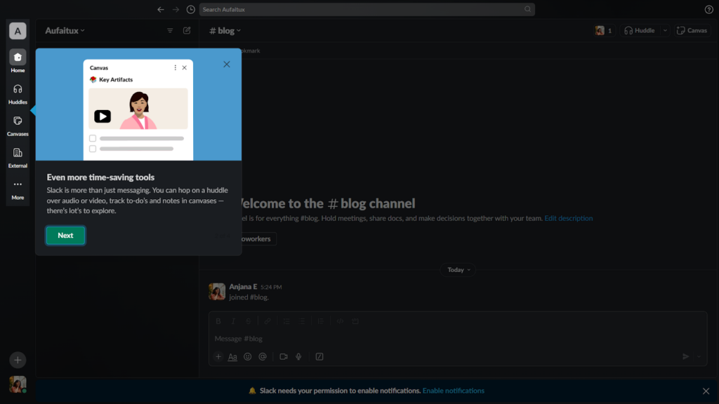
The most obvious place where empty state is required is during the first use. Unless it is a landing page or a multimedia platform, it is very likely that there will be nothing to show until the user takes some kind of action. Right after onboarding, when the user is faced with the prospect of doing anything and everything, it is important that they’re guided along the journey, before they grow uninterested and abandon the platform. This crucial phase would last barely a minute, where the user decides on either leaving or sticking around.
To hold their attention and also to guide them towards their next steps, you can either give coach marks or instructional bubbles.
For example, in Slack, you get a tour the moment you enter, which can make the overall experience feel well-thought out rather than random.
Point out errors
As long as our user base is human, we have to plan for errors. Heck, not even our “perfect” systems are immune to failing or messing up. A simple way to inform the user of what has gone wrong is through the usage of empty state. Often when things fail to load, to go through or finish, users experience mini frustrations that need to be addressed as soon as possible. Having them stare at their foibles with no reprieve will only worsen this. A quick fix would be to give them a clear feedback loop so that they can work accordingly.
Take for example this empty screen designed by Aufait’s design team. The error messaging is prominent and lets the user know what went wrong, along with a button that helps them move on.

💡Pro tip! This type of empty state is not complete without a means to rectify the error. Demonstrating or giving the user the option to take alternative steps goes a long way rather than just informing them of the issue.
Notify of completion
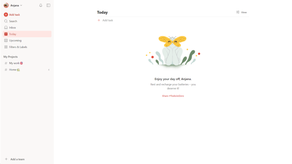
Another area that an empty state can help is when the user's goals have been achieved. A completely blank screen might not be as inspiring as acknowledging what they have done and urging them to continue or repeat the cycle.
This is very commonly seen in productivity tools, especially platforms where you can make to-do lists. The sense of accomplishment is often what will drive the user's motivation and is therefore worth marking in an overt manner.
Consider Todoist - Every Time you mark all your tasks complete, you are greeted with an
illustration and a warm message. They even take this opportunity to push a social media worthy hashtag #Todoistzero, which can draw in more users.
Instill patience
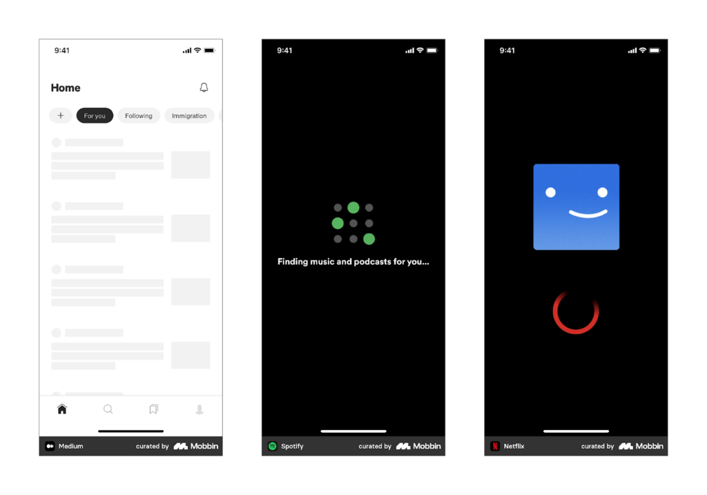
Loading and skeleton screens can indicate to the user that processes are still running in the background, which is a better alternative than letting the user wait without knowing what they’re waiting for. Loaders or skeletons can prolong the users patience by giving some context for their wait.
💡Pro tip! Try to have more concrete or interesting loading screens than a never ending spinner (right most), as vague loaders might be just as frustrating as a blank screen and can cause the user to exit the application.
Inspire action
Often, there’s nothing quite as intimidating and off putting as a blank page. This is no less true of digital platforms. When the user is in doubt it can help to be guided into a certain path that best fits their goals.
Notion does this by pairing every empty page with a set of quick action buttons for the user to get started.
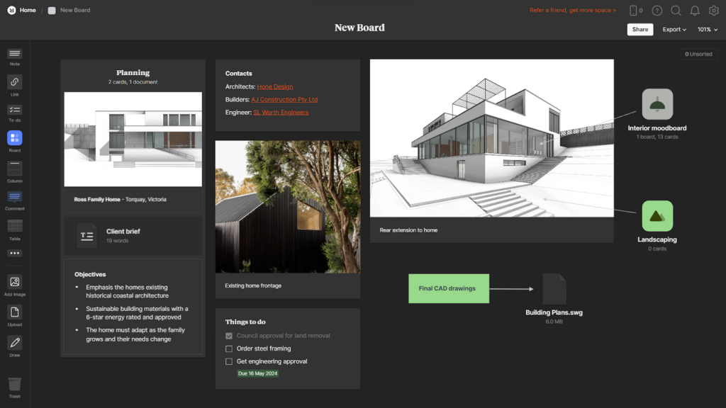
Provide a start
Sometimes, the user might not really understand how to make use of the app or website even after getting onboarded and exploring various actions. In such cases, it can help to provide a template for them to quickly fill in.
For instance, Milanote gives you multiple templates in new boards depending on your field of expertise, and even provides example content to help you get started.

Go one step further
Now that you know what kind of empty states you can expect in digital platforms, let’s consider two scenarios where empty states can be even more interesting.
Have a light hearted / fun moment
All of us would have played the dinosaur game in chrome at least once. It is the little t-rex that shows up when there is a network error, and its goal is to journey towards an unknown destination while dodging and weaving through countless obstacles.
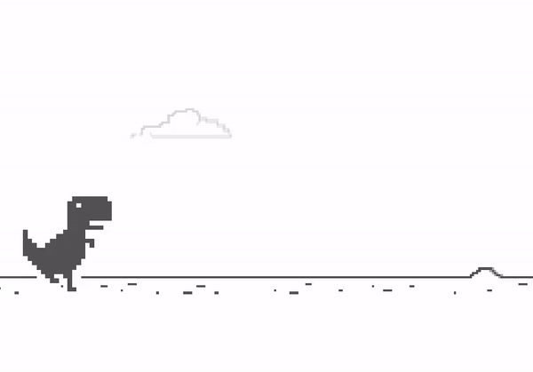
It takes a moment that could potentially frustrate a person, i.e. not having access to the internet, and turns it into a fun little mini game, where you keep trying to beat your last high score. It’s little things like this that make all the difference between user frustration and user delight.
Showcase the platform’s personality
We think a lot about branding in dynamic, action packed screens that empty screens can often get swept under the carpet. However, a platform that manages to imbue personality even when nothing particularly exciting is happening can succeed in feeling much more cohesive.
To use Todoist as an example again, simple illustrations and a very muted interface helps the platform feel calm and zen. The messaging and tone of voice is just as peaceful, that not at a single point while using do you feel out of place. Even the empty screen has been turned into an experience, which helps tie the whole platform together.

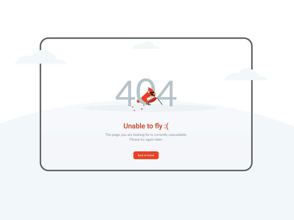
Here’s another example from our project. By repurposing the bird mascot you saw in the earlier screen, we created a consistency in branding which in turn makes the platform feel cohesive. As you can see, our UI UX design services prioritize preserving business objectives while adhering to design principles for user comfort and ease of use.
There is a saying that goes like this ‘The chain is only as strong as your weakest link’. The crux of this saying is that having strengths in one area might not mean much if there are spots that can lead to a collapse of the entire system.
While it is easy to dismiss empty state design as something very low on your list of priorities, a little effort can take your “weakest link” and turn them into the glue that ties your entire platform together.
Table of Contents
Ready to elevate your product design to the next level?
Hire us to create cutting-edge UX/UI designs that captivate, engage, and convert.
Contact us

